Syed Naimath 10 years ago
One of the most important aspects of a successful online business is list building. Most bloggers put their best foot forward by placing different types of email optin boxes at different places on their website. While some strategies have proven to be successful, others haven’t worked so well. Today, we’re going to discuss about six places on blogs that have brought maximum conversion for the bloggers.
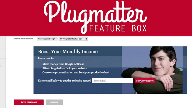
Off late, there has been an increase in the use of optin boxes below the header. A lot of popular bloggers including Jaime Tardy, Jon Morrow and many others have been using a fixed, non-intrusive optin box known as the feature box for their list building. These optin forms – that sit right below the header – usually take the entire width of the blog. They also make the site visually appealing while boosting email subscriptions.
OptinSkin, a popular list building plugin, allows bloggers to create an optin form right below a blog post. The idea is to grab the visitors’ attention immediately after he or she finishes reading the blog post.
Since the launch of OptinSkin, the use of email optins below the blog content has increased significantly. So, this is one place on your website that you might want to leverage for your email marketing.
Almost every popular blogger places a small optin form on the sidebar of his blog. The optin signup form, which is like a widget, sticks to the screen when it is scrolled down. This in turn allows the bloggers to convert the user-attention into successful email sign-ups.
Few popular blogs that has an email subscription box in their sidebar are – KISSmetrics blog, Social Media Examiner, Copyblogger, etc.
The latest trend in the email marketing industry is use of long (big) email subscription boxes in the sidebar. Adam Connell of BloggingWizard.com uses a longer, bigger email subscription box on its sidebar. Since it is non-intrusive, it would provide a better experience the visitors.
The advantage of having a longer optin form on the blog is that you can convey bigger messages to the visitors. Therefore, while a subscription box in the sidebar is good, trying a longer form is definitely worth it.
Although website footers do not grab visitors’ attention instantly, using a well-designed optin box is definitely worth trying. Visitors use Footer to learn more about the blog, blogger, products, services, etc. quite often.
So, why not place a sleek email subscription form, perhaps with lesser height? I’m sure it will help you get those additional sign-ups that you’d miss otherwise.
Using a list building form on the website header is quite unusual since it contains the Menu Bar followed by slides or value proposition below it. However, on the inner pages, the header section can be effectively used to grab those email addresses for your email marketing.
These are the six places on a blog that has proven to receive maximum conversion. The good part of using an optin form on these places is that – you can make them non-intrusive, get visitors’ eye-balls while giving them a pleasant experience of using your website.
Get weekly actionable tips, insights and case studies to maximize your results.